6 Current Options for CSS Preprocessors
This is a review of the six best CSS preprocessors out there right now.
1. Sass
We’ll start this article with the most well-known option. Sass, which requires Ruby, is probably the CSS preprocessor you’re most familiar with. It’s well-established, being an eight-year-old open source project, and it’s really the one that defined the genre of modern CSS preprocessors. There isn’t much I can say about Sass that hasn’t already been said on SitePoint before, but I’ll do a quick overview here for those new to the subject.
There are two syntaxes you can use for this CSS preprocessor:
- Sass: the original syntax
- SCSS: a newer syntax that’s very similar to native CSS
In Sass syntax, this is how you would define and use variables:
|
1
2
3
4
5
6
7
8
|
$serif-font-stack: "Georgia", "Times New Roman", serif$monospace-font-stack: "Cousin", "Courier"body font: normal 18px/22px $serif-font-stackpre, code font: 600 bold 18px/22px $monospace-font-stack |
This is the equivalent SCSS syntax:
|
1
2
3
4
5
6
7
8
9
10
|
$serif-font-stack: "Georgia", "Times New Roman", serif;$monospace-font-stack: "Cousin", "Courier";body { font: normal 18px/22px $serif-font-stack;}pre, code { font: 600 bold 18px/22px $monospace-font-stack;} |
You’ll see that the newer syntax (which has become the most recommended option by many experienced Sass developers) is much more similar to natural CSS. There’s more we can say about the syntax, but much has been said before and I encourage you to check out the docs for more details.
2. Less.js
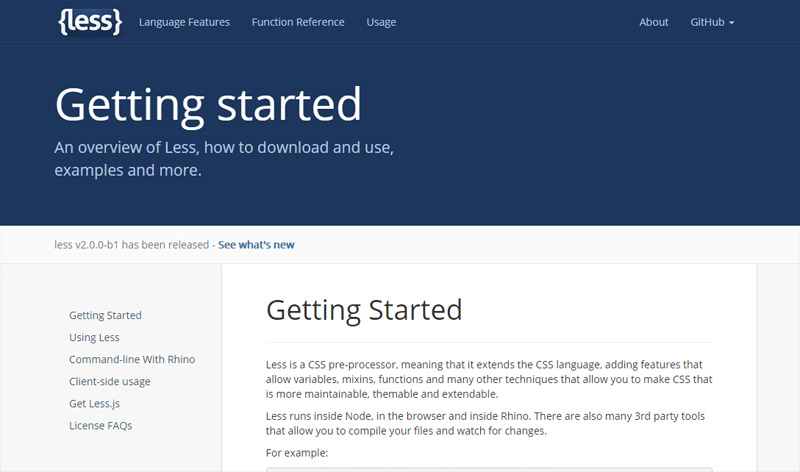
Less.js, (usually referred to simply as “Less”), is one of the most popular CSS preprocessors, and is probably currently the strongest competitor to Sass. Less extends CSS syntax thoroughly with mixins, variables, nested style rules, and even rule-set looping (which behaves similarly to for loops in a programming language).
One common feature found in CSS preprocessors are mixins, or the ability to mix-in properties from one rule set into another. In Less syntax, this is how you could include a mixin of the properties found in a class named .button into another class named .button-checkout-process:
|
1
2
3
4
5
6
7
8
9
10
11
12
13
14
15
16
|
.button { display: inline-block; width: 80%; max-width: 200px; border-radius: 5px; background-color: black; color: white; font-size: 14px; margin: 5px; padding: 8px;}.button-checkout- process { .button(); /* Mixin */ background-color: silver;} |
Less is easy to set up. If you just want to play around with it without putting in the work required to install and configure it for production, just download the Less.js JavaScript file and reference it in your HTML document (or serve it off your favorite public CDN, create a .less file and then reference it after the Less.js script, and you’re good to go:
|
1
2
3
4
5
|
<head> <!-- Reference Less JavaScript file --> <script src="path/to/your/less.js"></script> <link rel="stylesheet/less" type="text/css" href="your/styles.less" /> </head> |
The Less implementation method I just described is great for when you’re developing in the browser. It’s quick and hassle-free. But — and this is a very important point — once you’re ready to deploy on a production web server, you should pre-compile your .less files into regular .css files to improve Web performance. The way you would do that is through Node’s command-line interface. For example, to compile styles.less into a file called styles.css, and also to minify the CSS output, you would issue this command:
|
1
|
lessc styles.less -x styles.css |
3. Stylus
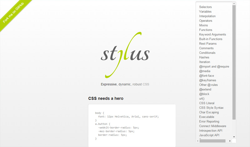
Stylus is another one that’s been a strong competitor to Sass, and is a feature-rich extension of CSS. It has over 60 custom functions including saturation(), which lets you mathematically adjust the saturation of a CSS color.
The Stylus syntax also allows you to omit braces ({}), colons (:), and semi-colons (;), or you can use plain CSS.
Here’s a sample of the Stylus syntax:
|
1
2
3
4
|
.button display inline-block border-color saturation(#000, 50%) border-radius 5px |
The above example will compile to this:
|
1
2
3
4
5
6
7
|
.button { display: inline-block; border-color: #959595; -webkit-border-radius: 5px; -moz-border-radius: 5px; border-radius: 5px;} |
4. CSS-Crush
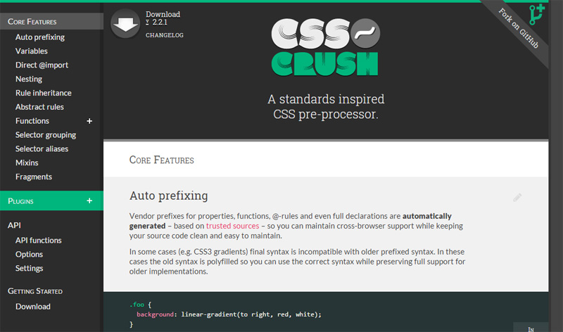
CSS-Crush has all the features you would expect in a modern CSS preprocessor: auto-vendor-prefixing, variables, mathematical operations, property inheritance via nested rule sets, and much more.
What makes CSS-Crush particularly unique, and what might compel you to choose it as your preprocessor, is it’s implemented in PHP. PHP, as you know, is a popular scripting language that’s already configured in virtually all web hosts and is the native language used in popular website platforms like WordPress, Magento, and Drupal. Unlike other preprocessors, you don’t need to configure Node.js or Rails for CSS-Crush to work, making it a convenient choice for many developers because of how easy it is to integrate into an existing development stack.
To use CSS-Crush, you need to include it in the appropriate PHP file (or templating system) like so:
|
1
|
<?php require_once 'path/to/CssCrush.php'; ?> |
Then, optionally, you can configure CSS-Crush to work the way you want it to. For example, let’s say you don’t want to minify your CSS (by default, minification is enabled). After referencing the CSSCrush.php file, you can invoke the following function with the appropriate parameters to establish your preference:
|
1
|
<?php csscrush_set(minify, false); ?> |
To define variables, you will use the @set directive. Let’s say you want to define some device widths. Here’s how you’d do that with the CSS-Crush syntax:
|
1
2
3
4
5
6
|
@set { smartphone-width: 320px; tablet-width: 768px; laptop-width: 1680px; 4k-monitor-width: 3840px;} |
After declaring your variables, you can reference them throughout your CSS. Below is a media query example that uses the smartphone-width variable shown in the previous code example:
|
1
2
3
4
5
|
@media only screen and (min-device-width: smartphone-width) { h1 { font-size: 24px; }} |
When you need to change stuff — for example, you might decide you now want smartphone-width to be 380px instead of 320px — you only need to change the width value once in the @set directive, instead of all throughout your CSS files.
5. Myth
Myth, which requires Node.js, lets you use future CSS syntax today without having to wait for web browsers to implement a new proposed CSS feature or for the W3C to complete the feature’s specs. This means that when the feature is finally supported in modern browsers, you don’t have to rewrite your code.
For instance, the current status of the calc() property expression is murky. There’s a report saying it’s supported in 78% of browsers used today, but the W3C spec, which is in candidate recommendation (CR) status, says that it’s “at-risk and may be dropped.” So can we/should we use it or not? The answer is uncertain.
But, with Myth, we can use calc() without worrying about specification status and browser support. Myth will take care of all the necessary code to make the property expression function in the browser. For example, here’s a W3C-valid way of usingcalc():
|
1
2
3
|
.container { margin: calc(7px*2); } |
Myth will compile the above example to:
|
1
2
3
|
.container { margin: 14px;} |
What’s great about Myth is you don’t need to learn a new syntax. It uses existing and proposed W3C-standard CSS features.
6. Rework
Rework is for the hardcore, discerning front-end engineers among us. It’s what you would use if you wanted to roll your own CSS preprocessor. Myth (discussed earlier) was developed on top of the Rework open-source project.
Maybe you don’t like the Stylus syntax, or maybe you don’t like having to provide a CSS unit argument for CSS-Crush’s custom math() function, or perhaps you dislike how Sass makes you define variables using the $ sign and you’d rather use #. Maybe you just need a few features, and don’t want to suffer through the feature-bloat of existing preprocessors.
Rework is a CSS preprocessor framework built on Node.js. It has a great set of helper plugins for stuff you might want to preprocess. So before you write your own parsing functions, you might want to take a look at them first to avoid reinventing the wheel.
Other CSS Preprocessor Options
Here are some other, more obscure options for CSS preprocessors. I didn’t examine these in-depth, so you’ll have to examine them for yourself to see if they would suit your needs.
- Clay: A CSS preprocessor created using Haskell
- DtCSS: A PHP script that parses DtCSS syntax into CSS
- CSS Preprocessor: A preprocessor implemented in PHP5. This one’s old and looks inactive.
- Switch CSS: A CSS preprocessor that runs on Apache (mod_python needs to be installed and enabled)
What CSS Preprocessor Do You Use?
Have you used one of these options discussed above? Do you have any suggestions on using them? Or maybe you know of another one not listed here. We’d love to here your thoughts in the comments.
Source Link: http://www.sitepoint.com/6-current-options-css-preprocessors/


