Create a Customized Print Stylesheet in Minutes
Printed versions of a web design are rarely what you’d expect. They take some additional tweaking and some staging. But, an understanding of how to set up a print view so that content comes out as expected is not too tough once you get the hang of it.
In this article, I’ll show you how to set up a stylesheet just for printing off your content on a website. I’ll be using a WordPress site as a starting point, because it’s such a popular framework, but this will work for any site so long as you apply the same principles.
Quick note: there’s no easy way to make web to print perfect. You have to jump in there and work through each element you want to tailor. I start by going to a page and printing it to see what I’m starting with. Then, I break each element or structural section down by what I need and what needs to change. It takes time, but it’s worth it.
Do You Need a Print Version?
The first thing I ask myself before building out a printed version of a site is whether or not I even need one. The meticulous designer in me tends to kick in and I lean towards “yes” in most cases. But, often there’s just not a need for a print stylesheet, depending on the nature and purpose of your website.
Also, when people print a page off your site, what is their goal? Often, they just want your content in hand and that’s all — they don’t want all the graphics, pretty layouts, headers, sidebars, and the like. (And, they may not want to use their expensive ink on nonessential elements.) So, consider what is actually needed.
Print Considerations
I always convert my text to black so that the printer understands that no shading is necessary (which is a big ink saver). I also change over from font sizes in pixels to points. If you’re trying to match font sizes, this can be a bit of a challenge, but here’s a slick chart to help you convert quickly from px to pt assuming you have a base font size of 16px:
- Pixels => Points
- 6px => 5pt
- 7px => 5pt
- 8px => 6pt
- 9px => 7pt
- 10px => 8pt
- 11px => 8pt
- 12px => 9pt
- 13px => 10pt
- 14px => 11pt
- 15px => 11pt
- 16px => 12pt
- 17px => 13pt
- 18px => 14pt
- 19px => 14pt
- 20px => 15pt
- 21px => 16pt
- 22px => 17pt
- 23px => 17pt
- 24px => 18pt
Targeting Your Content
WordPress typically has a built-in structure that looks like this:
- header
- content
- comments
- sidebar
- footer
Every page has these structural elements that you can easily target with CSS. Even if your site doesn’t have this exact structure, the key is to simply customize your print stylesheet for your purposes.
Target each structure in CSS using #header for those sections with an ID or .header if it’s a class.
Lastly, and possibly most importantly, we’re going to be using the @media print CSS to define when certain CSS styles are applied properly.
For example, to remove all content from your print styles, you would do something as simple as this in your style.css:
|
1
2
3
4
5
6
7
8
9
10
11
12
|
@media print {#header {display:none;}#content {display:none;}#comments {display:none;}#sidebar {display:none;}#footer {display:none;}.site-description {display:none;}.site-title {display:none;}} |
This worked for the Twenty Twelve theme for WordPress and gives me a nice, clean blank slate to start with.
If you’re struggling to remove a straggler element, the easiest thing to do is right-click the element in your browser and find it in your source document. Chrome has the “Inspect Element” feature which jumps right to the code for that element, making it very easy to find the offending element. Look for either the id or class definition and then target it accordingly.
In this example, we may have had this straggler popping up in our prints. Here you can see the ID:
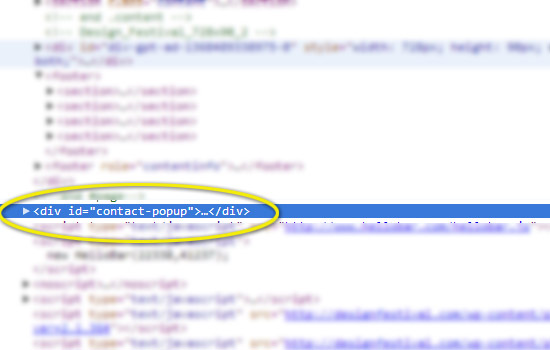
We can now target this element with the following CSS:
|
1
|
#contact-popup {display:none;} |
Page Breaks
Printers break your content up into pages, assuming you have more than one page to print. You can tell the browser to avoid page breaks at certain points. You can read all about page breaks in CSS at the W3.org page. In short, your options are as follows:
- page-break-before: always | avoid — always/avoid page breaks before the item
- page-break-after: always | avoid — always/avoid page breaks after the item
- page-break-inside: always | avoid — always/avoid page breaks in the middle of the item
Bear in mind that page breaks only apply to block content. A common example is a list — you may want to make lists blocks and then prevent page breaks happening in the middle of a list. The exception is text, which you can define as a block and then use the page breaks to change how it will print, but typically text should flow and you can allow the browser to figure out where to place it.
Sample Case
Now that we have a blank slate, let’s start adding the structural pieces that we actually want to display when printed. The content section is an obvious candidate, so let’s add it back in and convert the paragraph font size to points:
|
1
2
3
4
5
6
7
8
9
10
11
12
13
14
15
16
17
18
19
20
21
22
23
24
25
26
|
@media print {#content p { font-size:11pt; color: black;}#content img { display:block; page-break-after: avoid; page-break-inside: avoid;}#content ul, li { display:block; page-break-inside:avoid;}#header {display:none;}#comments {display:none;}#sidebar {display:none;}#footer {display:none;}.site-description {display:none;}.site-title {display:none;}} |
I removed the display:none; content CSS and converted our paragraph text from 14px to 11pt. You can go through each element of your page and customize each just for printing with this methodology.
Wrap Up
Going from web to print can be frustrating, but the @media print media query allows us to get very targeted with how what elements get printed and how they get printed.
There’s no real shortcut. If you need your site to look good in print, you’re likely going to have to create a separate CSS definition on a per element level until it’s perfect.
Are print stylesheets part of your standard design process, or do you consider them an extra, nice-to-have addition to a thoroughly-designed website?
Source Link: http://www.sitepoint.com/create-a-customized-print-stylesheet-in-minutes/
Related Posts

HTML5 Forms: CSS
Remove Default Styling You’ve probably noticed browsers applying default formatting. For example, most browsers apply…
How to Create a Calendar Icon in HTML5 and CSS3
It looks great, is ideal for a smart phone calendar app and is very topical…