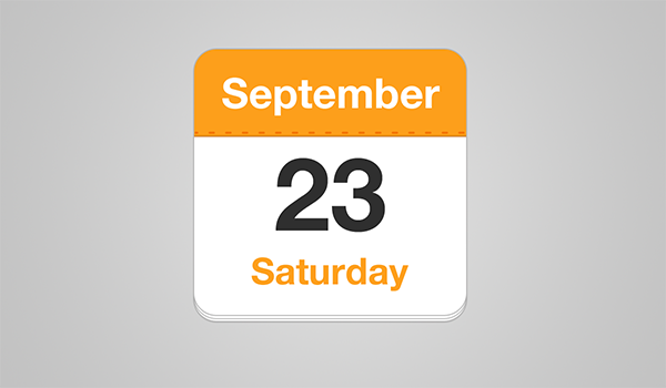
How to Create a Calendar Icon in HTML5 and CSS3
It looks great, is ideal for a smart phone calendar app and is very topical as we move into 2014.

Would it be possible to create a similar icon in HTML5 for use and re-use in any web page? Of course it would … otherwise I wouldn’t have written this article!
The Options
A few years ago we would have required a PNG or GIF image. You can still do that, but they’re not easy to change, cannot be indexed by search engines and are not scalable. A better option would be a Scalable Vector Graphic (SVG); it would permit more flexibility but we don’t necessarily need it.
Therefore, I’m going to use the little-known HTML5 time element. Its sole purpose is to represent a date and/or time — perhaps for an event or anniversary. The basic element uses the following syntax for 9.01pm on September 20, 2014:
|
1
|
<time>2014-09-20T21:01:00Z</time> |
You could define just the day: 2014-09-20, the month: 2014-09 or the year: 2014. The final ‘Z’ represents Coordinated Universal Time (UTC). You can replace it with your own time zone, e.g. +01:00, -06:00, etc.
While the content is machine-readable, it’s not particularly easy for humans. Therefore, you can place the date/time definition in a datetime attribute and use something more friendly for the content which is specific to your language and locale, e.g.
|
1
|
<time datetime="2014-09-20T21:01:00+08:00">9:01pm, Saturday September 20<sup>th</sup>, 2014</time> |
You should certainly consider the time element when using microdata and microformats.
The Calendar Icon HTML
Our calendar icon will use the following HTML code:
|
1
2
3
4
5
|
<time datetime="2014-09-20" class="icon"> <em>Saturday</em> <strong>September</strong> <span>20</span></time> |
The time element is given a class of “icon” to indicate it should be styled.
I’ve used em, strong and span for the day, month and date primarily as CSS selector hooks. They’re inline elements without strict semantic meaning so, even without styling, the date is readable. However, you can use different elements if necessary.
The Calendar Icon CSS
First, we’ll define the icon’s outer styling:
|
1
2
3
4
5
6
7
8
9
10
11
12
|
time.icon{ font-size: 1em; /* change icon size */ display: block; position: relative; width: 7em; height: 7em; background-color: #fff; border-radius: 0.6em; box-shadow: 0 1px 0 #bdbdbd, 0 2px 0 #fff, 0 3px 0 #bdbdbd, 0 4px 0 #fff, 0 5px 0 #bdbdbd, 0 0 0 1px #bdbdbd; overflow: hidden;} |
The icon height and width is set to 7em. We can therefore change the font to any size we like and the icon will scale accordingly. Try it!
The page effect at the bottom of the icon is applied using multiple box-shadow styles at different y-offsets. I initially considered using pseudo-elements, but they won’t work because we have defined overflow: hidden (which crops the month banner to the rounded edge).
Note we’ve set a relative position so the inner elements can be positioned. Let’s apply their basic styles:
|
1
2
3
4
5
6
7
8
9
|
time.icon *{ display: block; width: 100%; font-size: 1em; font-weight: bold; font-style: normal; text-align: center;} |
The universal selector (*) applies the same styles to any element within the icon. That will probably be fine but, if you had different calendar layouts, you may want to be more explicit.
The month is styled using the following code:
|
1
2
3
4
5
6
7
8
9
10
|
time.icon strong{ position: absolute; top: 0; padding: 0.4em 0; color: #fff; background-color: #fd9f1b; border-bottom: 1px dashed #f37302; box-shadow: 0 2px 0 #fd9f1b;} |
This positions the banner at the top of the icon and creates perforations using a dashed border. Since the banner is larger than the perforated edge, I’ve used another box-shadow below it.
The day is positioned at the bottom edge:
|
1
2
3
4
5
6
|
time.icon em{ position: absolute; bottom: 0.3em; color: #fd9f1b;} |
The large date number is resized and has some basic positioning applied:
|
1
2
3
4
5
6
7
|
time.icon span{ font-size: 2.8em; letter-spacing: -0.05em; padding-top: 0.8em; color: #2f2f2f;} |
Finally, I added a little animation when you hover or focus on the icon — but I’ve leave you to work that out for yourselves.
The icon works on all modern browsers including IE9 and above (animation works on IE10+). The effect degrades gracefully in IE8 and below although you should see a reasonable effect if you apply the HTML5 shim to your pages. However, I did discover an unusual Webkit/Blink animation bug while developing the demonstration — but I’ll save that for another article.
Have fun using the code for your own calendar icon effects.
Source Link: http://www.sitepoint.com/create-calendar-icon-html5-css3/

