

In my last post, Pure CSS3 Speech Bubbles Without Images, we saw how the :before and :after pseudo-elements could be used to create different effects. In this post we’ll use similar techniques to create a variety of ribbons.

h2 tag:

<h2>My Heading</h2>
Let’s give this a little style and make it overlap the containing element:
/* containing element */
#page
{
	width: 500px;
	padding: 50px;
	margin: 0 auto;
	background-color: #fff;
	border: 1px solid #333;
}

h2
{
	position: relative;
	width: 50%;
	font-size: 1.5em;
	font-weight: bold;
	padding: 6px 20px 6px 70px;
	margin: 30px 10px 10px -70px;
	color: #555;
	background-color: #999;
	text-shadow: 0px 1px 2px #bbb;
	-webkit-box-shadow: 0px 2px 4px #888;
	-moz-box-shadow: 0px 2px 4px #888;
	box-shadow: 0px 2px 4px #888;
}
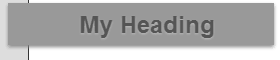
position: relative so the other ribbon elements can be positioned as necessary.


h2:after
{
	content: ' ';
	position: absolute;
	width: 0;
	height: 0;
	left: 0px;
	top: 100%;
	border-width: 5px 10px;
	border-style: solid;
	border-color: #666 #666 transparent transparent;
}
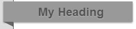
h2:before
{
	content: ' ';
	position: absolute;
	width: 0;
	height: 0;
	right: -2px;
	top: 0px;
	border-color: transparent #fff transparent transparent;
}

h2:before
{
	content: ' ';
	position: absolute;
	width: 30px;
	height: 0;
	left: -30px;
	top: 12px;
	border-width: 20px 10px;
	border-style: solid;
	border-color: #999 #999 #999 transparent;
}
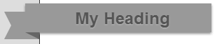

Please see the demonstration page for an example which shows all three ribbon styles. It works as expected in IE8, IE9, Firefox, Chrome, Safari and Opera. IE6 and IE7 degrade gracefully and show the main overlapping title. All the CSS code is contained in the HTML source.
Source Link: http://www.sitepoint.com/pure-css3-ribbons/