HTML5 Forms: CSS
Remove Default Styling
You’ve probably noticed browsers applying default formatting. For example, most browsers apply rounded corners to search boxes and add subtle background gradients that can look misplaced on your flat design.
To remove default styling, you can use the appearance: none; property, which requires prefixes. However, use with caution since it can remove essential styles — checkboxes and radio buttons disappear in Chrome! To be on the safe side, only apply the property when it’s required and test in as many browsers as possible, e.g.
|
1
2
3
4
5
6
7
8
9
10
11
12
|
input[type="text"],input[type="email"],input[type="tel"],input[type="number"],textarea { -webkit-appearance: none; -moz-appearance: none; -ms-appearance: none; appearance: none; outline: 0; box-shadow: none;} |
Note I have also reset the outline and box-shadow to remove the default ugly blue box-shadow focus and error styling in all browsers.
The appearance property is documented on CSS-Tricks but it’s in a state of flux.
:focus
:focus has been supported since CSS2.1 and sets styles for the field currently being used, e.g.
|
1
2
3
4
5
|
input:focus,textarea:focus,select:focus { background-color: #eef;} |
:checked
:checked styles are applied to checked checkboxes or radio buttons, e.g.
|
1
2
|
<input type="checkbox" name="test" /><label for="test">check me</label> |
|
1
2
3
|
input:checked ~ label { font-weight: bold;} |
There is no corresponding ‘:unchecked’ selector but you shouldn’t need one: simply create a default style then apply changes when :checked is activated. Alternatively, you can use :not(:checked).
:indeterminate
:indeterminate is technically not yet in the spec, though it is mentioned. According to the spec, it represents a checkbox or radio button that is “neither checked nor unchecked.”
It is unusual in that it only applies styles when you set a checkbox’s .indeterminate property via JavaScript, i.e.
|
1
|
document.getElementById("mycheckbox").indeterminate = true; |
It has no effect on the .checked property, which can only be true or false.
There are few a situations when :indeterminate could be useful. If you had a list checkboxes, you could provide a ‘check all’ checkbox that checked or unchecked every item when clicked. However, if you check some of the items, the ‘check all’ checkbox could go into an indeterminate state.
:required
:required applies styles to any input that has a required attribute and must be entered prior to submit.
:optional
:optional applies styles to any input that does not have a required attribute. I’m not sure why it’s been added since :not(:required) would do the same?!
:valid
:valid applies styles to any input that currently holds valid data.
:invalid
Similarly, :invalid (or :not(:valid)) applies styles to any input that currently holds invalid data, e.g.
|
1
2
3
|
input:invalid { border-color: #900;} |
:in-range (number and range inputs)
Numbers and ranges holding a valid value between the min and max attributes that adhere to the step value can be selected using :in-range. Obviously, it’s a little difficult for a slider to be out of range, but…
:out-of-range (number and range inputs)
:out-of-range targets invalid number values for range inputs.
:disabled
Inputs with a disabled attribute can be targeted with the :disabled pseudo-class, e.g.
|
1
2
3
4
|
input:disabled { color: #ccc; background-color: #eee;} |
Remember that disabled fields will not be validated or have their data posted to the server. However, styles for pseudo-classes such as :required and :invalid will still be applied.
:enabled
Similarly, non-disabled fields can be selected with :enabled (or :not(:disabled)). In practice, you’re unlikely to require this selector since it’s the default input style.
:read-only
Inputs with a readonly attribute can be targeted with the :read-only pseudo-class. Remember that read-only inputs will still be validated and posted to the server but the user cannot change the values.
:read-write
Standard read-write fields can be selected with :read-write (or :not(:read-only)). Again, it’s not a selector you’ll need often.
:default (submit buttons or inputs only)
Finally, we have the :default selector, which applies styles to the default submit button.
Placeholder Text Style
The placeholder attribute text can be styled using the ::placeholder pseudo-element with vendor-prefixes (in separate rules), e.g.
|
1
2
3
4
|
input::-webkit-input-placeholder { color: #ccc; }input::-moz-placeholder { color: #ccc; }input:-ms-input-placeholder { color: #ccc; }input::placeholder { color: #ccc; } |
CSS Specificity
The selectors above have the same specificity so some care is necessary when defining two or more styles that apply to the same input. Consider:
|
1
2
|
input:invalid { color: red; }input:enabled { color: black; } |
Here we require all invalid fields to use red text but it’ll never happen because we’ve defined all enabled fields to have black text later in the stylesheet.
Keep selectors simple and use the minimum amount of code. For example, an empty :required field will be :invalid so it’s rarely necessary to style the former.
Validation Bubble
On submit, the first invalid value is highlighted with an error bubble:
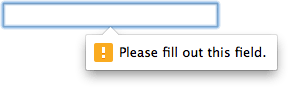
The bubble design will vary across devices and browser. Only the Webkit/Blink browsers permit a level of non-standard CSS customization:
|
1
2
3
4
|
::-webkit-validation-bubble { ... }::-webkit-validation-bubble-arrow { ... }::-webkit-validation-bubble-message { ... }::-webkit-validation-bubble-arrow-clipper { ... } |
My recommendation: don’t bother trying. If you require custom error formatting you’ll almost certainly want to use custom messages. For that, you’ll require JavaScript.
Browser Support
In general, the important styles and selectors work in all modern browsers from IE10+. Some of the less useful ones, such as in-range are Webkit/Blink only for now. Older browsers will support :focus but, for anything more sophisticated, you’ll need to provide JavaScript fall-backs.
Creating Usable Forms
The styles above are applied immediately. For example:
|
1
2
3
|
input:invalid { border-color: #900;} |
applies a red border to any invalid field. Unfortunately, when the page first loads every field could be invalid and the user is confronted with a daunting set of red boxes.
Personally, I prefer errors to appear on submit or perhaps when changing focus from a field that’s invalid. Browsers offer no way to do that natively. You guessed it — you need JavaScript. Fortunately, the HTML5 constraint validation API provides the tools to:
- halt validation until a form is used
- use custom error messages
- polyfill unsupported input types
- provide fall-back styling and validation for older browsers, and
- create more usable forms
We’ll take a closer look at these in the last part of this series.
Source Link: http://www.sitepoint.com/html5-forms-css/
Related Posts

How to Create a Calendar Icon in HTML5 and CSS3
It looks great, is ideal for a smart phone calendar app and is very topical…
CSS3 Transition Property Basics
Which CSS Properties Can Be Animated? In general, a transition can be applied to any…