Mastering CSS3 Text Shadows
Today we are going to focus on the text-shadow.
Just to remind you: both properties, while defined in different modules, actually work in a similar way. So if you are already familiar with the box-shadow you will easily understand the basics of the text-shadow’s art. Before we jump into the practice, let’s delve a little bit into the theory to find out what the difference is between them.

Browser Support
The text-shadow rule is supported by many modern browsers including IE10. You can also use it in your metro style apps for Windows 8.
text-shadow versus box-shadow
The first thing you need to know is that both specs (CSS3 Backgrounds and Borders and CSS3 Text) are, for now, in the Working Draft status and thus they may still change. I will also discuss the specs while talking about the spread-distance.
If you remember, the syntax of the box-shadow property looks like this:
box-shadow: none | <shadow> [ , <shadow> ]*;

<shadow> = inset? && [ <length>{2,4} && <color>? ]
The second rule in the full mode can be expanded as:
shadow = inset? h-offset v-offset blur-radius spread-distance color;
The spec for CSS3 Text describes the text-shadow property in a similar way:
text-shadow: none | [ <length>{2,3} && <color>? ]#
Where:
Values are interpreted as for box-shadow.
So you may think of the full syntax for one text-shadow effect as:
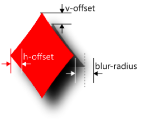
shadow = h-offset v-offset blur-radius color;
There are two differences here: first—you can’t create an inner shadow for the text, and second—there is no spread-distance for text-shadow in CSS3 Text. Similar to the box-shadow you can create multiple shadows displayed on top of each other. Now let’s have some practice.
text-shadow
Offsets and Color
We will start from the very first steps—to define some horizontal and vertical offsets all that you need is to write two length values (1.1–1.4):
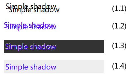
Positive offsets move the shadow to the right and down (1.1):
text-shadow: 10px 10px; width: 300px;
Negative values define an offset moved to the left and up (1.2):
text-shadow: -5px -5px; width: 300px; color: blue;
Next is the color. Let’s first discuss what happens when the color is omitted.
According to current version of the spec:
If the color is absent, the used color is taken from the ‘color’ property.
If you look across different browsers you may notice that their behavior on that differs. Webkit-based browsers use transparent color in that case—and not because they are bad or they are doing something wrong. The point here is that the previous edition of the CSS3 Backgrounds and Borders spec said:
omitted colors are a UA-chosen color.
I believe it will be fixed in future versions of Chrome, Safari and other webkit-browsers.
Omitting the text-shadow color, and thus applying to it the same color that the text has, could be useful if you would like to create a blurred text effect (see samples 2.3 and 2.4 below).
To explicitly set the shadow’s color just add the color you want at the end of the rule:
text-shadow: -1px -1px white; color: blue; background: #333; /* 1.3 */
text-shadow: 1px 1px rgba(255,255,255, 0.5); color: blue; background: #eee; /* 1.4 */
Note that while working with shadows you can use any color format defined in the CSS3 Color module including rgba() and hsla() functions with alpha-channel.
Blurring
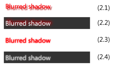
The third length parameter is for the blur-radius (2.1–2.4):
In accordance with the definition of blur-radius for the box-shadow property, you should use a nonnegative value (0 for no blurring). Exact blurring algorithms can differ from one browser to another, but in the mathematical sense they should all be close enough to the Gaussian blur algorithm.
In the first two samples (2.1–2.2), I’m using different values for blur-radius:
text-shadow: 5px 5px 3px darkred; color: red; /* 2.1 */
text-shadow: 4px -4px 10px red; color: azure; background: #333; /* 2.2 */
In the second pair (2.3–2.4), I’m changing only the text and background color, and both shadows’ effects are applied using the CSS class blurred-shadow:
.blurred-shadow {

  text-shadow: 0px 0px 4px ; /* the color is absent */

}
color: red; /* 2.3 */
color: lightgray; background: #333; /* 2.4 */
Expansion and Contraction
Now it is time to talk some more about web standards. I believe you should know them before you try to use the spread value in text-shadow in any of your projects. While working on the CSS3 Text module, the CSS Working Group decided to make a change to the previous version of this spec to allow quicker progress towards the recommendation status. In this previous edition the text-shadow property included one more (a fourth) length parameter—spread-distance.
Similar to the box-shadow, spread-distance for text-shadow allows us to expand or contract the shadow. That definition of the text-shadow was moved to the L4—and today you can find it in the Editor’s Draft for CSS Text Level 4.
Now I’m going to discuss how to use spread. You can try it in the latest versions of IE10 (I know at the current moment IE is the only browser to support spread for text-shadows). Spread is a really powerful tool and allows us to create some amazing samples! But it may also change in the future. So be careful!
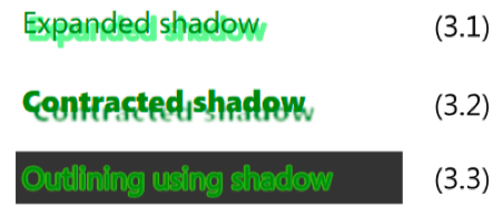
To increase the shadow, set the spread-distance to a positive value (3.1):
text-shadow: 5px 5px 0px 3px lightgreen; color: green;
To decrease—a negative one (3.2):
text-shadow: 8px 8px 2px -3px darkgreen; color: green; font-weight: 900;
In the case of zero offset, spread-distance can be used to outline the text (3.3):
text-shadow: 0 0 0 3px rgba(128, 255, 0, 0.75); color: green; background: #333;
And one more important note! Today, the fourth length in the text-shadow rule is treated by nonsupporting browsers as an incorrect text-shadow definition, and such rules are simply ignored. So if you would like to provide some level of compatibility for them you will need to double your text-shadows rules like this:
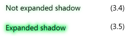
text-shadow: 0px 0px 10px lightgreen; /* 3.4 */
text-shadow: 0px 0px 10px 10px lightgreen; /* 3.5 */
The shadow’s expansion could be emulated using multiple shadows with offsets in various directions (see samples 4.6 and 4.7 in the next section).
Multiple Shadows
Finally, and absolutely similar to the box-shadow, you can apply multiple shadows to the text (4.1–4.5):
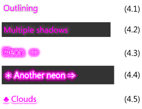
Simple outlining (4.1):
text-shadow: 0 0 0 3px white, 0 0 0 4px gray; color: magenta;
Various blurred shadows with various offsets (4.2):
text-shadow: 3px 3px 4px 2px rgba(255,255,255,0.35),

             6px -6px 4px 2px rgba(255,255,255,0.25),

             -3px -3px 4px 6px rgba(255,0,255,0.15);
Neon-effect (4.3):
text-shadow: 0 0 0 3px white,

             0 0 2px 6px magenta,

             0 0 1px 9px white,

             0 0 6px 12px magenta;
And another neon-effect (4.4):
text-shadow: 0 0 2px #fff,

             0 0 4px 2px rgba(255,255,255,0.5),

             0 0 6px 6px #f0f,

             0 0 4px 7px #fff,

             0 0 3px 15px #222,

             -4px 0 2px 9px #f0f,

             4px 0 2px 9px #f0f,

             0 -4px 2px 9px #f0f,

             0 4px 2px 9px #f0f;
Text underlining (4.5):
text-shadow: 0 -3px 3px 15px white, 0 1px 2px 9px; color: magenta;
Emulating Expansion
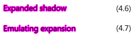
As I mentioned, technically you can use multiple shadows to create something similar to the real shadow expansion. So to emulate the expanded shadow sample (4.6):
text-shadow: 0px 0px 0px 4px magenta;
You can try to define multiple shadows with different offsets in various directions (4.7):
text-shadow: magenta 0px 2px,

             magenta 2px 0px,

             magenta -2px 0px,

             magenta 0px-2px,

             magenta -1.4px -1.4px,

             magenta 1.4px 1.4px,

             magenta 1.4px -1.4px,

             magenta -1.4px 1.4px;
Actually, there is some visual difference, and you should understand that this technique has limited usage: it is less accurate, and negatively affects the performance of page rendering.
More Samples
Now, as you already know all the basics of the text-shadow’s art, let’s try to build something more complex.
Classic rainbow (5.1):

text-shadow: 0 0 2px 3px yellow,

             0 0 2px 6px orange,

             0 0 2px 9px red,

             0 0 2px 12px lime,

             0 0 2px 15px blue,

             0 0 2px 18px violet;
Double shadow (5.2):
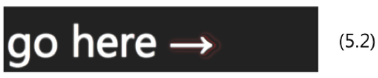
text-shadow: 0 0 2px 2px white,

             2px 0 2px 5px #222,

             3px 0 3px 6px #933,

             5px 0 2px 14px #222,

             6px 0 5px 16px #533;
Flame-shadow (5.3):

text-shadow: 0 0 2px #eee,

             0 0 4px 2px #fff,

             0 -2px 4px 2px #ff3,

             2px -4px 6px 4px #fd3,

             -2px -6px 11px 6px #f80,

             2px -8px 18px 8px #f20;
Traditional “letter-press” effect (5.4):
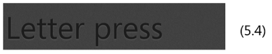
text-shadow: 0px 2px 3px #555;
Also, traditional 3D text (5.5):

text-shadow: 0 0 1px #999,

             1px 1px 1px #888,

             2px 2px 1px #777,

             3px 3px 1px #666,

             4px 4px 1px #555,

             5px 5px 1px #444;
Double shadow for a vintage-effect (5.6):
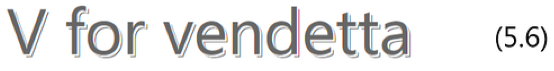
text-shadow: 2px 2px #fff,

             3px 3px #666;
Transparent text with contracted shadow (this effect also relies on the font size and typeface)—sample (5.7):
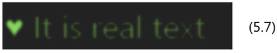
text-shadow: 0 0 2px -3px rgba(196,255,0,0.3),

             0 0 6px -5px #9c6;

color: transparent;
Using the text-shadow on the CSS pseudo-class ::first-letter (5.8):

.text {

  text-shadow: 0 0 5px;

}


.text::first-letter {

  color: azure;

  text-shadow: 0 0 5px, 0 0px 6px 3px blue, 0 -2px 6px 6px cyan, 0 -4px 9px 9px lightblue;

}
Interactive Sample
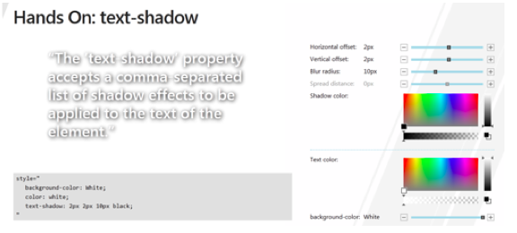
If you wish to play with shadows in an interactive way, my colleagues created a cool demo for the Build conference last September: Hands On: text-shadow.
Note
CSS properties discussed in this article are defined in the CSS3 Text module which is currently in the Working Draft status. While it seems to be quite stable, it still can change in details.
Source Link: http://www.sitepoint.com/mastering-css3-text-shadows/
Related Posts

HTML5 Forms: CSS
Remove Default Styling You’ve probably noticed browsers applying default formatting. For example, most browsers apply…
How to Create a Calendar Icon in HTML5 and CSS3
It looks great, is ideal for a smart phone calendar app and is very topical…