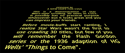
I always try to offer practical tips on SitePoint. Really. This isn’t one, but I couldn’t resist it. Without further ado…

(Chrome, Safari or Firefox)
How cool is that? No JavaScript, no graphics — just pure HTML5 text and CSS3. It works in Chrome, Safari and Firefox. Opera won’t show the 3D transform in the current release, but it’ll work. Internet Explorer. Hmmm. Sorry, but you’ll need to wait for IE10 since previous versions don’t support transformations and animations.
The effect is remarkably easy to implement. The HTML requires an outer element (#titles) and a section which will be scrolled (#titlecontent):
<div id="titles"><div id="titlecontent">

	<p>content</p>

</div></div>
The outer DIV is positioned at the bottom center of the browser window then rotated using 3D perspective using a transform (note that vendor prefixes have been omitted here, but they’re in the actual code):
#titles
{
	position: absolute;
	width: 18em;
	height: 50em;
	bottom: 0;
	left: 50%;
	margin-left: -9em;
	font-size: 350%;
	font-weight: bold;
	text-align: justify;
	overflow: hidden;
	transform-origin: 50% 100%;
	transform: perspective(300px) rotateX(25deg);
}
A pseudo-element is applied to overlay a fade-out gradient at the top of the outer DIV:
#titles:after
{
	position: absolute;
	content: ' ';
	left: 0;
	right: 0;
	top: 0;
	bottom: 60%;
	background-image: linear-gradient(top, rgba(0,0,0,1) 0%, transparent 100%);
	pointer-events: none;
}
Then all we need do is scroll the content using CSS animation:
#titlecontent
{
	position: absolute;
	top: 100%;
	animation: scroll 100s linear 4s infinite;
}

@keyframes scroll {
	0% { top: 100%; }
	100% { top: -170%; }
}
(Note you could also use margin-top instead of absolutely-positioning the content, but it didn’t seem as smooth.)
That’s all there is to it. If you want to delve further: view the source, Luke.
Please use the code as you wish, but I hope this article doesn’t lead to the re-introduction of pointless Star Wars-inspired splash pages!
Source Link: http://www.sitepoint.com/css3-starwars-scrolling-text/