Thinking Laterally: Build a Side-scrolling Site Layout with CSS & jQuery
Ever since I saw Tyler Finck’s Sursly.com, I’ve been looking everywhere for an excuse to try out a smooth-scrolling horizontal layout like his. It’s by no means a new trend, but it’s one that few of us have had the opportunity to use, and it’s still unusual enough that you really do notice when you see it.
A sideways style lends itself well to designs with a bit of an “arty” feel: brochure-style sites, galleries, portfolios, and perhaps even sites that make use of interesting info-graphics or charts. Successful horizontal layouts often use animation and graphics to highlight their sideways movement — a large number of these sites use colorful images and nice, big backgrounds that really show this off. Unusual also means unfamiliar, so a well-designed horizontal layout will also make good use of navigation elements such as menus, arrows, and buttons to overcome any usability hitches.
As far as what goes into one of these sites — well, it turns out that it’s actually pretty easy. Let’s take a look at how to build our own groovy, scrolly, sideways website using just a bit of simple CSS and jQuery.
Planning it out
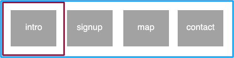
First of all, we’ll need to figure out what’s happening in this site. Imagine that we’re building a simple brochureware site for a fictional brick-and-mortar store selling fashionable shoes. There’s very little information to convey here:
- a small piece of introductory text
- a newsletter signup
- directions and contact info
- a contact form
Fashion is a pretty groovy sort of business, so the unusual horizontal layout is a good fit for this sort of site. If you can imagine each of the four items as being a panel, then you might arrange each of them in a row. Only one panel would be visible at one time, just as if they were separate pages, meaning that our layout’s overall width needs to be a good deal wider than the browser window — our viewport. In the diagram below, our viewport is represented by a red square surrounding the first panel, and the overall width of our body element is represented by a blue one:
This should be easy enough to code!
Adding markup and styles
To mark this up, we can use four little div elements inside a body. The markup for this might look something like the following example:
<body> <div id="home" class="panel"> ... </div> <div id="newsletter" class="panel"> ... </div> <div id="directions" class="panel"> ... </div> <div id="contact" class="panel"> ... </div> </div> </body> To achieve the effect of each panel being a standalone “page”, and also to give us some space to play with for our animation, we’ll need each of the panels to occupy at a lot more space than our viewport — let’s allow 960 pixels for the actual content, and an additional 1040 pixels for extra space, making each panel occupy a total of 2000 pixels in width. Here’s a little CSS to make this work for us:
body { width: 8000px; } .panel { width: 930px; float: left; padding-left: 30px; padding-right: 1040px; } You can see how this looks so far in demo 1, which also includes some content and shading. Unless you have a gratuitously wide monitor, you should only see one page at a time whilst you scroll from side to side. Groovy!
Adding navigation
This is all very well so far, but what about an easier way to move around the page? Let’s build a menu of four links:
<ul id="banner"> <li> <a href="#home">Home</a> </li> <li> <a href="#newsletter">Newsletter</a> </li> <li> <a href="#directions">Directions & Opening Hours</a> </li> <li> <a href="#contact">Contact us</a> </li> </ul> Of course, the links’ targets match the divs’ IDs, so we know that clicking on each would let us leap straight to the relevant anchor on the page. However, as soon as we click one, our menu disappears — it’s back at the top left of the body element, where we can no longer see it. If we use a fixed position to attach the menu to the top of the page, we can even make sure it sticks around while we go zooming around. An item with fixed positioning is removed from the overall flow of the layout — we’ll need to add some more space at the top of those panels to leave room. While we’re at it, let’s make that menu look a little more like a menu:
.panel { ... margin-top: 45px; } ul#banner { position: fixed; line-height: 45px; margin: 0 30px; padding: 0; } ul#banner li { display: inline; } We’ve made space for the menu by setting a line-height of 45 pixels, and a matching top margin on the panels to make sure they stay well clear. You can see the result in demo 2, where you can click all four links and bounce between panels.
Smooth scrolling
Now that you have your content and menu in place, you can use a little bit of jQuery to smoothly animate around your nice long canvas. We’ll listen out for clicks on our menu links, and then replace the default behaviour with our own: instead of just jumping right to that part of the page, we’ll smoothly scroll over to the right element using jQuery’s animation methods. Here’s what that looks like:
$(document).ready(function() { $("#banner a").bind("click",function(event){ event.preventDefault(); var target = $(this).attr("href"); $("html, body").stop().animate({ scrollLeft: $(target).offset().left, scrollTop: $(target).offset().top }, 1200); }); }); Here’s how that breaks down: first, we prevent the default behaviour from occurring. Next, we set up a variable to hold the href value of our link. Thirdly, we perform a few actions with both the html and body elements:
stopmakes sure that any currently playing animations stop right away — if someone’s clicking on several menu links, we won’t have to wait for all the scrolling actions to complete.- Next, to animate our scroll behaviour — we work out where we need to scroll by calculating how far away our
targetis, relative to the left and top of the document, and usescrollLeftandscrollTopto do so. - We set a duration of 1200 milliseconds (1.2 seconds) for the effect, which should leave plenty of time for admiring the scenery as it whizzes by.
That’s all you need! Demo 3 shows you how it all comes together.
But what about the pretty stuff?
Now that you have the bones in place, you can start adding some colour and liveliness to your sidescrolling design. I’m certainly no Tyler Finck, but even I can improve on the grey, boxy demos we’ve seen before. In demo 4, you’ll see that I’ve added a big background image that changes the feel of the site from panel to panel. I’ve also added some opacity to the background colour on the menu, and rearranged the markup somewhat to allow for a title in the menu there. Finally, I’ve rearranged this somewhat so that when JavaScript is off, the layout reverts to a regular vertical-scrolling one.
- Use previous and next buttons on each panel, guiding your readers along a path
- Add some more adventurous background images in those big, wide gaps between content areas
- Why be restricted to horizontal scrolling? Use this technique to zoom all over a big, square canvas!
- Use JavaScript to add more or less space between panels, based on the current viewport size
- Roll this into a set of media queries — little screens can certainly skip the show
However you choose to use it, one thing’s for sure — while this has been a bit of a trend in web design for awhile, it’s still unusual enough that your site’s sure to stand out. I know I’ll be considering it for my next mini site!
And if you enjoyed reading this post, you’ll love Learnable; the place to learn fresh skills and techniques from the masters. Members get instant access to all of SitePoint’s ebooks and interactive online courses, like Learn CSS3.
Source Link: http://www.sitepoint.com/side-scrolling-site-layout-with-css-and-jquery/
Related Posts

HTML5 Forms: CSS
Remove Default Styling You’ve probably noticed browsers applying default formatting. For example, most browsers apply…
How to Create a Calendar Icon in HTML5 and CSS3
It looks great, is ideal for a smart phone calendar app and is very topical…